Disability & design: Building digital products for UX accessibility

TL;DR: Creating digital products designed for UX accessibility is a moral obligation as much as a way to reach broader audiences and stand out from competitors. This article reviews the WCAG guidelines provided by the W3C, as well as punctual best practices in designing for users with visual, hearing, cognitive, and physical disabilities.
In its World Report on Disability, the WHO (World Health Organization) estimated that 15% of the global population has one or more forms of disability. The non-profit organization named WebAIM (Web Accessibility in Mind) also determined that 97.4% of the top one million websites have issues related to UX accessibility. More than one billion users will have difficulties visiting those websites. Moreover, research shows that 1 in 12 men are color blind, which, for us, translates into even more needs. The list can go on.
Creating digital products with UX accessibility in mind isn’t only a way of promoting innovation, targeting a bigger audience, or increasing the number of downloads. It’s also a moral obligation.
In this article, we’ll go through the definition of web accessibility, the guidelines provided by the W3C, and some best practices that can make your brand stand out from an infinite list of competitors.
What’s UX accessibility?
UX accessibility seems complex, but it has a clear meaning: designing with an inclusive mindset to serve our users. It’s about keeping user needs at the epicenter of the design process from start to finish.
Different aspects influencing accessibility needs, such as global population behavior and the emergence of new diseases, should lead us to create digital products accessible to a wide range of customers, including people with physical or cognitive impairments.
Designing for accessibility should make us feel confident, too, no matter the type of user we’re targeting. Users should be able to carry out a task in a determined time frame with similar efforts. Doing so will eventually result in a group of customers empowered to navigate digital experiences intuitively and independently. This also removes common frustrations provoked by a poor design strategy or implementation.
Accessibility vs. usability
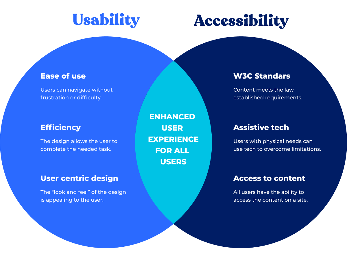
Usability is a common term used in UX. It mainly refers to the ability to design easy-to-use, functional, and efficient products, and it should consider three major components:
- Consistency: All sections, components, and call-to-action elements should maintain not only visual unity but also consistency in the copy.
- Learnability: Navigation should be memorable and easy to recall for present and future interactions.
- Efficiency: The tasks intended for users should be clear and take place with the fewest number of clicks.
In theory, usability shares most of UX accessibility’s key concepts. In practice, however, a product with good usability isn’t necessarily accessible to everyone.
If our objective is to embrace a broader spectrum of users and provide them with an optimized user experience that will make our company stand out from the competition, then we should go further in usability testing and start considering not only physical but cognitive and economic disabilities as well.

Accessibility in design: WCAG guidelines
The first document to address web accessibility issues, known as WCAG (Web Content Accessibility Guidelines), was created by the W3C back in 2006 through their Web Accessibility Initiative (WAI). Since then, many organizations, governments, and other institutions have contributed to keeping the guidelines up-to-date.
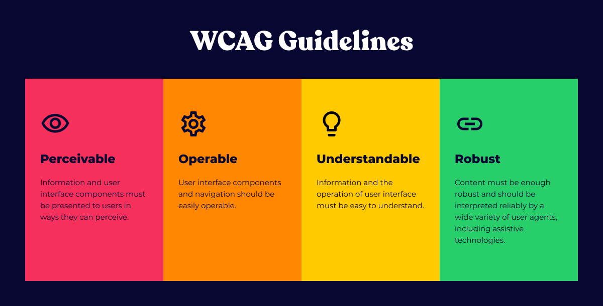
To be accessible, a digital product must be perceivable, understandable, operable, and robust, according to the WCAG. The following image further explains those four main principles:

Best practices in UX accessibility
By following the guidelines described in the WCAG, we’re creating a product that’s accessible to a wide range of users. We should incorporate creative solutions and functionalities that serve people with disabilities — and ensure their experience is smooth and intuitive when consuming digital products.
To better understand accessibility features, we should also consider the design process. We can organize the guidelines by disability type, for example. By following these practices, we’ll expand our product reach and maximize its monetization potential. Here are a few examples.
Visual and hearing disabilities
- Establish a minimum text size (16pt recommended.
- Ensure good contrast between background and text. There are several tools you can use: for example, Are My Colors Accessible and the Contrast plugin for Figma.
- Add Alt tags and descriptive captions.
- Consider a zooming function that allows users to scale your design accordingly.
- Include text transcripts and audio descriptions for pre-recorded media.
Cognitive disabilities
- Keep your layout as clean as possible and avoid cluttered design. Some people with cognitive disabilities may otherwise feel overwhelmed.
- Use concise and simple text and provide definitions for specific complex words. We don’t want users to lose attention when consuming our content.
- Use visual elements — icons, illustrations, audio, or video — to support your written message.
Physical disability:
- Include error and confirmation messages in your design and clear instructions when you want your users to perform a specific task.
- Give users a way to skip steps or another alternative, such as voice control. It could be difficult for some people to reach the mouse or tap a screen section.
- Ensure the clickable or tappable areas are big enough and easy to interact with.
- Avoid excessive scrolling.
Accessible design should become standard for all organizations. When creating digital products, we should ensure they’re usable for anyone, whether they live with some form of disability or not. By putting WCAG guidelines into practice, you’re broadening your products’ scope and placing inclusive, user-friendly design at the center.
Partner with Blankfactor to broaden your reach with accessible products
Designing and developing with an accessible mindset means better digital experiences for users — and that means happier, more loyal customers. At Blankfactor, we help companies leverage accessibility and smart UX design to create better products and drive new revenue opportunities.
From full-stack product development to data strategy to enterprise AI, we bring the comprehensive technical skills you need to drive your company forward. Contact us today for a 60-minute solution session.
Was this article insightful? Then don’t forget to look at other blog posts and follow us on LinkedIn, Twitter, Facebook, and Instagram.


